

Design practice of Tancrède Ottiger : graphic and type designer, teacher. Listed typefaces are available on ToSupply.
Founded in 2015, the studio is characterized by a collaborative practice with many players in the field of design such as developers, photographers, industrial designers, architects & filmmakers. The studio is covering works in all mediums, from print to digital design : books, publications, identities, web design and scenography.
Type design has been a key element of the design process from the very begining. The studio offers both retail and bespoke typefaces for clients. Recognized magazines such as Frame or Marie Claire used TO fonts in their design.
Furthermore, the practice conducts a constant reasearch into production means and new technologies, producing up to date custom tailored solution for each project. The interactive map created for the Ateliers de Renens or the generating identity tool for the Teintureries drama school stands as good examples of this approach.
Teaching
2020–ECAL/University of Art and Design, Lausanne ( CH )
2020–Eracom, Lausanne ( CH )
Lectures
2021ECAL/University of Art and Design, Lausanne ( CH )
2019ECAL/University of Art and Design, Lausanne ( CH )
2017Eikon, Fribourg ( CH )
Exhibitions
2020Weltformat Graphic Design Festival, Lucerne ( CH )
2016ECAL Graphic Design, Beijing ( CN )
2016ECAL Graphic Design, Shanghai ( CN )
2016ECAL Graphic Design, Hong Kong ( HK )
2016ECAL Graphic Design, Paris ( FR )
2015Swiss Ambassy, London ( UK )
Press
2016Ligature.ch
2016Frame
2015idPure no. 38
Collaborators
Alice Franchetti
Aurèle Sack
Adrien Rovero
Benoit Jeannet
Etienne Malapert
Gavillet-Cie
Giliane Cachin
Matthieu Gafsou
Romain Cazier
Younès Klouche
Credits
Development : Romain Cazier
Photography : Etienne Malapert, Younès Klouche
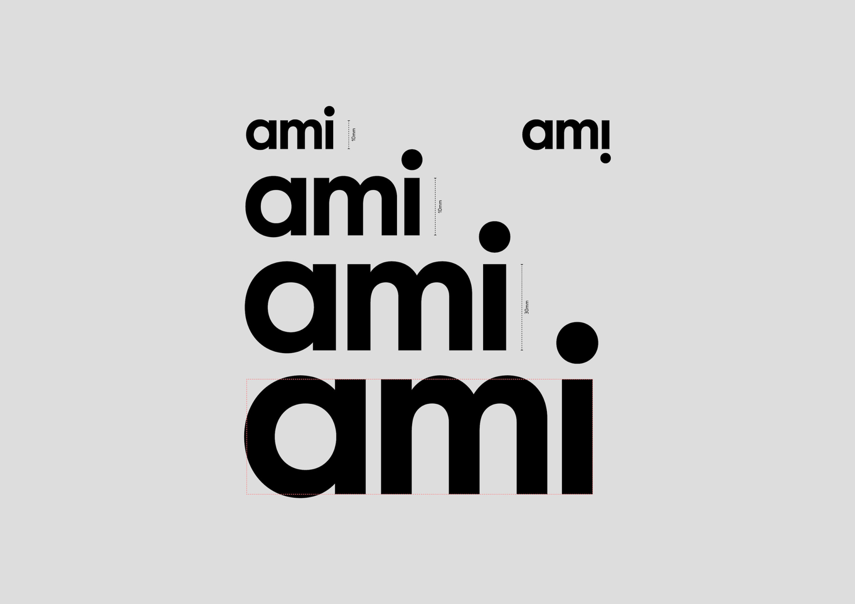
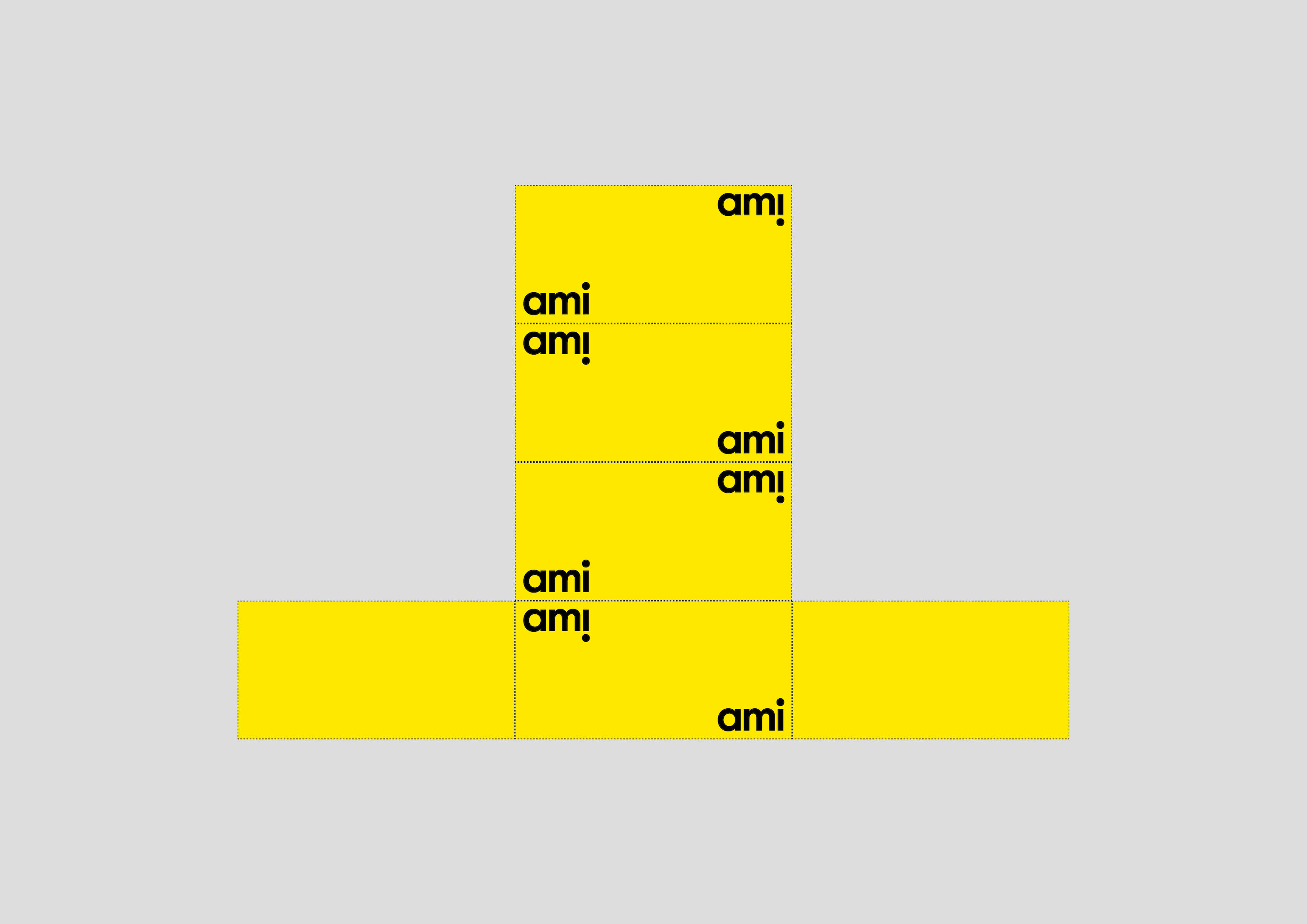
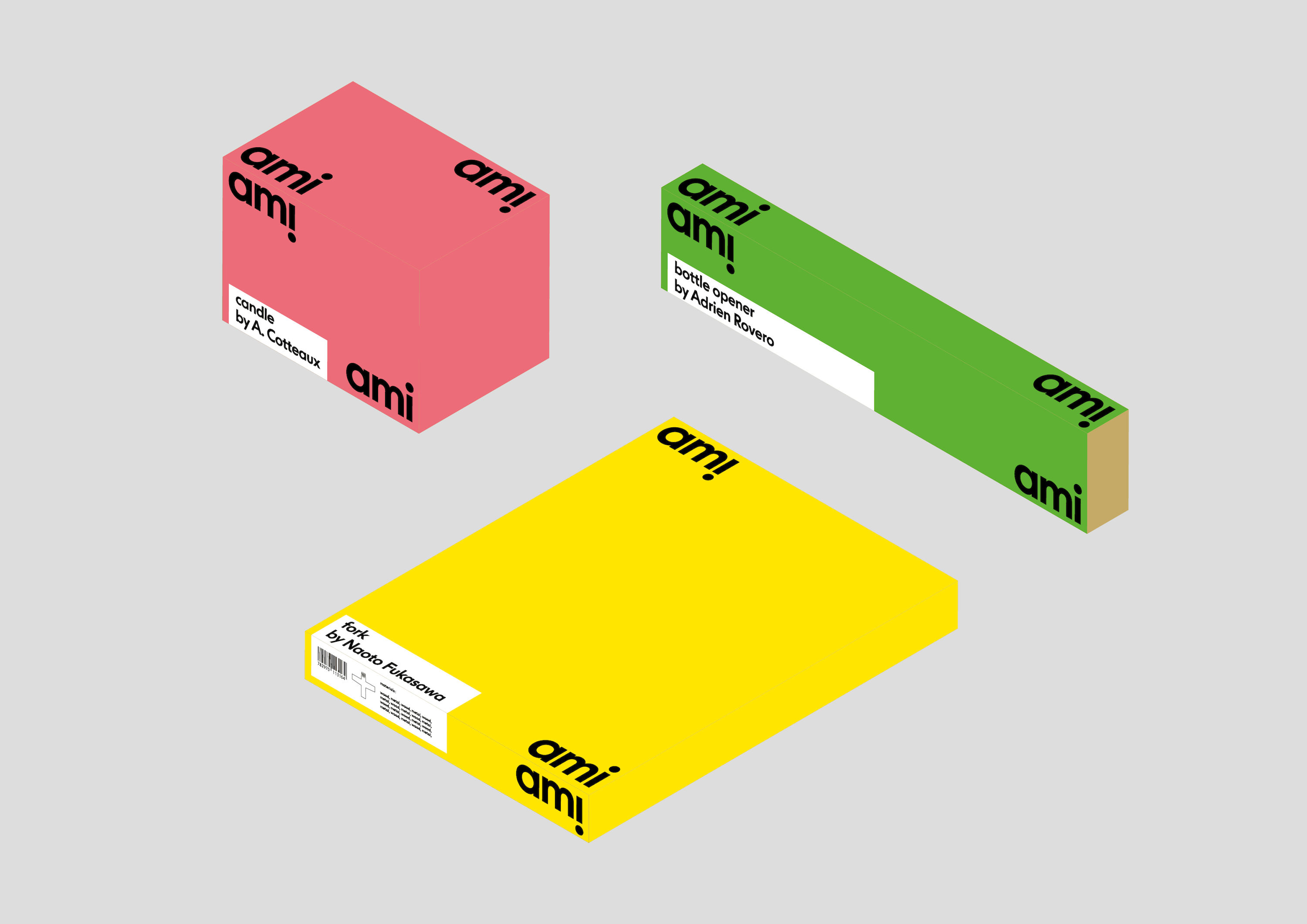
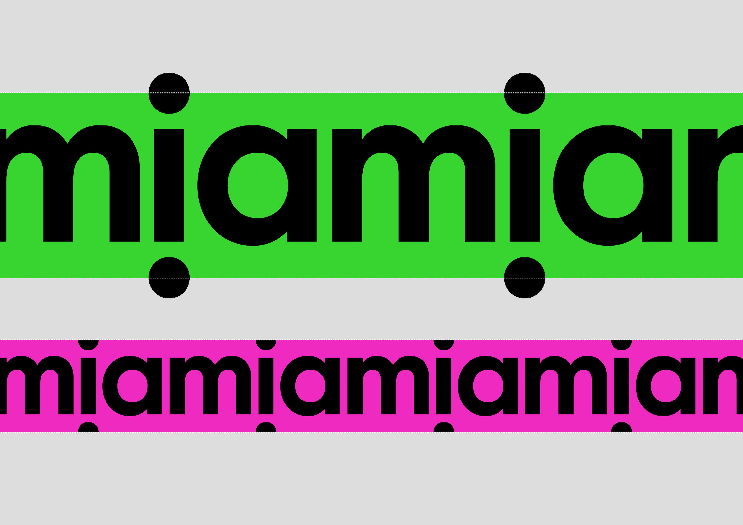
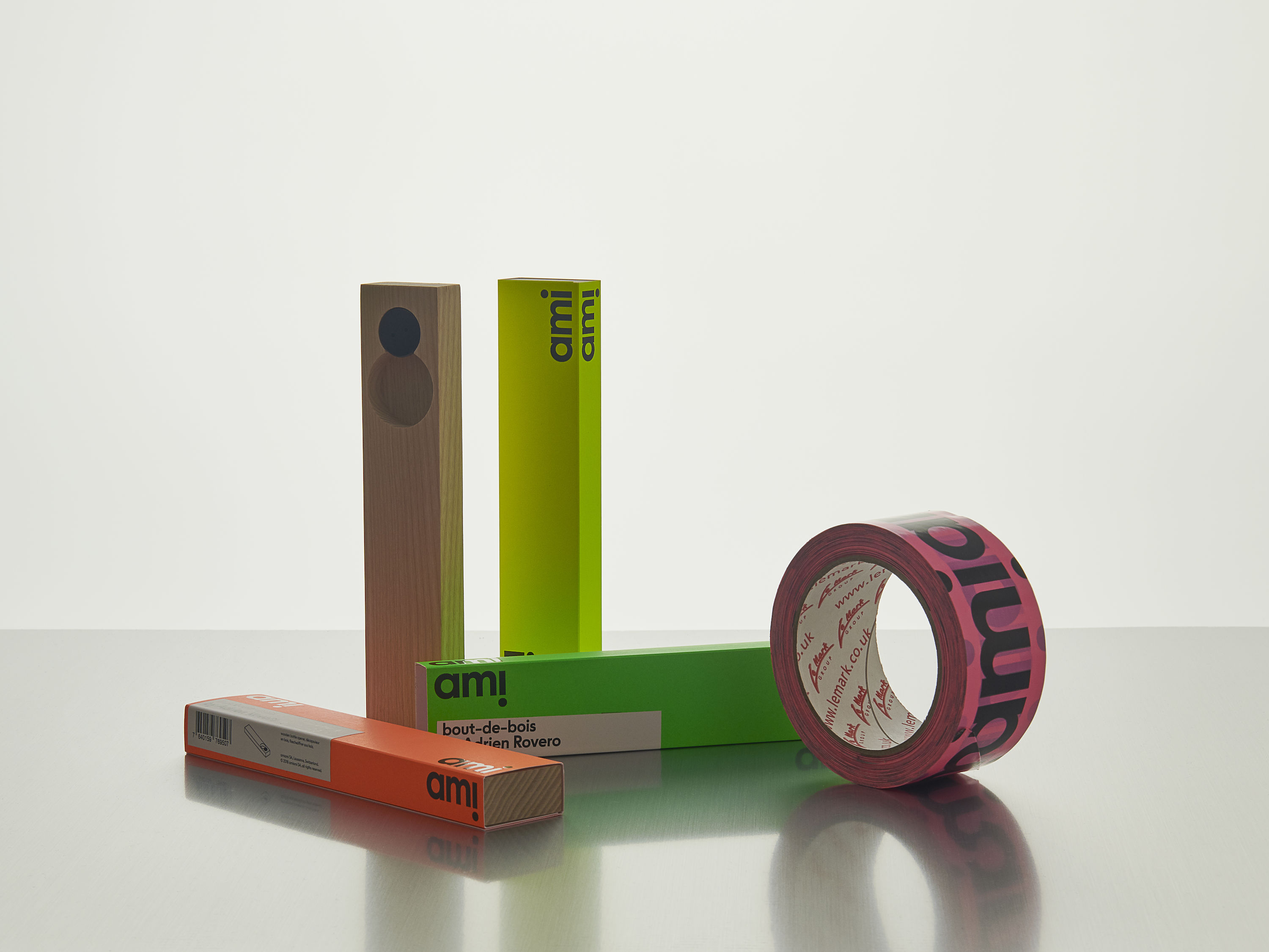
Creation of the visual identity for the design brand Ami Ami. The logo is built on the repetition of the word “ami”, in order for the “i” to represent characters looking at each other. The logotype is then positioned systematically in the corner so that they can be seen in perspective.
