Overview
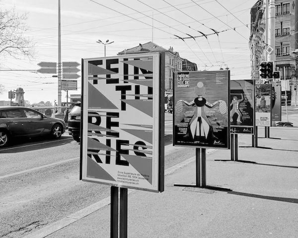

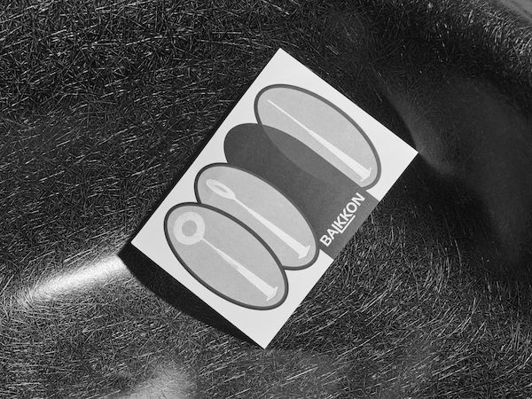
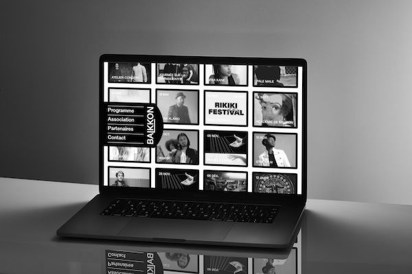
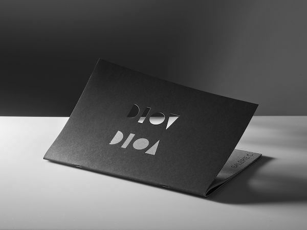
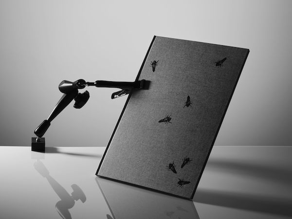
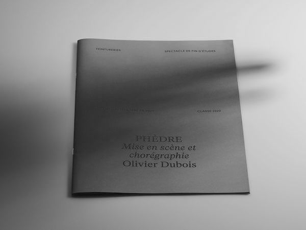
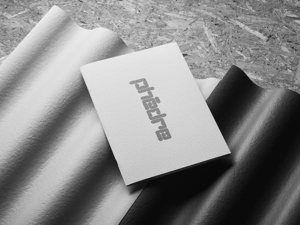
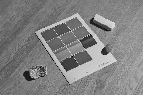
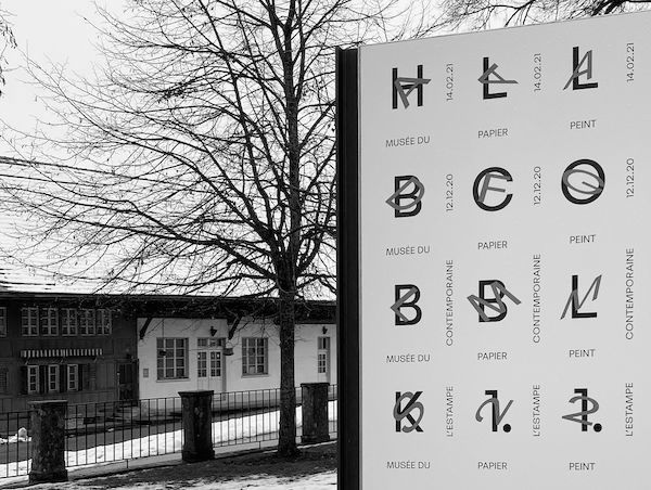
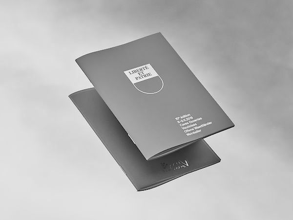
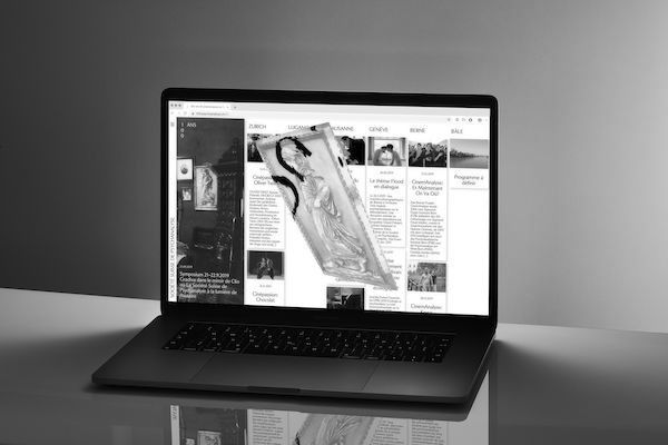
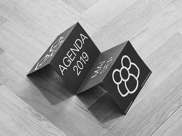

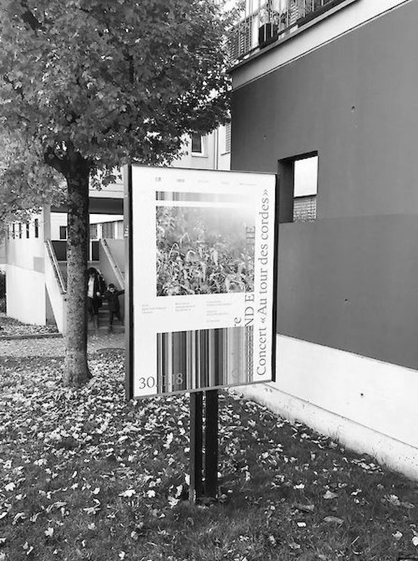
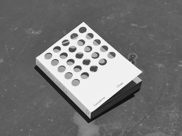
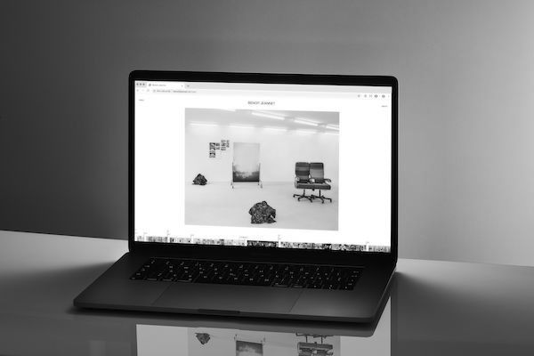
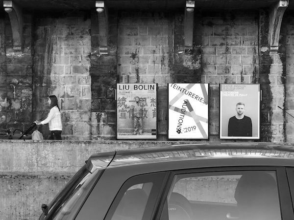
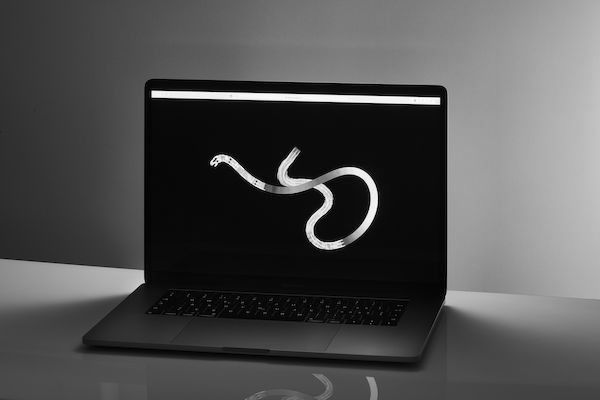
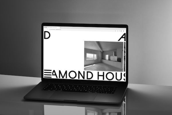
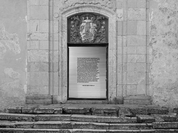
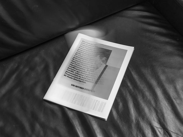
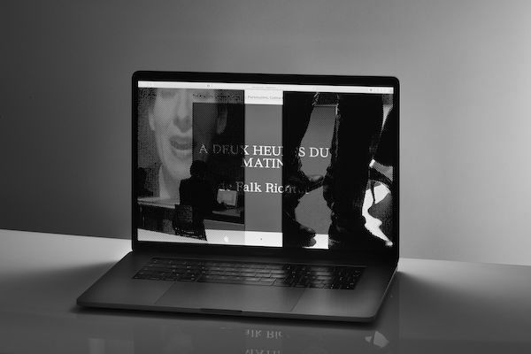
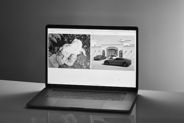
Design practice of Tancrède Ottiger : graphic and type designer, teacher. Listed typefaces are available on ToSupply.
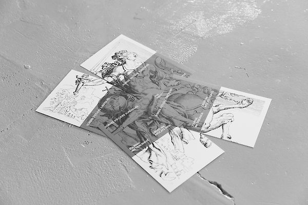
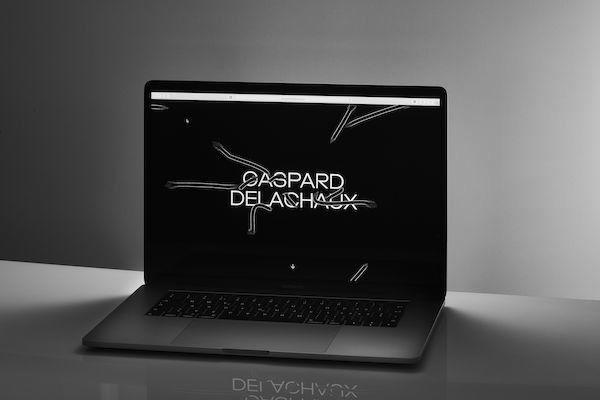
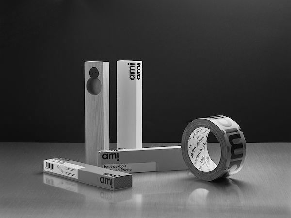
Founded in 2015, the studio is characterized by a collaborative practice with various players in the field of design such as developers, photographers, designers, architects & filmmakers. The studio works across a range of media, from print to digital : typefaces, visual identities, websites, books, publications and scenography. Typography plays a central role in the studio’s design process, and great care is taken to select the texture that best conveys the intended message. In addition, the studio conducts an ongoing reasearch into production means and new technologies in order to provide a meaningfull solution for each project.
Teaching
2020–ECAL/University of Art and Design, Lausanne ( CH )
2020–Eracom, Lausanne ( CH )
Lectures
2021ECAL/University of Art and Design, Lausanne ( CH )
2019ECAL/University of Art and Design, Lausanne ( CH )
2017Eikon, Fribourg ( CH )
Exhibitions
2020Weltformat Graphic Design Festival, Lucerne ( CH )
2016ECAL Graphic Design, Beijing ( CN )
2016ECAL Graphic Design, Shanghai ( CN )
2016ECAL Graphic Design, Hong Kong ( HK )
2016ECAL Graphic Design, Paris ( FR )
2015Swiss Ambassy, London ( UK )
Press
2016Ligature.ch
2016Frame
2015idPure no. 38
Collaborators
Alice Franchetti
Aurèle Sack
Adrien Rovero
Benoit Jeannet
Etienne Malapert
Gavillet-Cie
Giliane Cachin
Matthieu Gafsou
Romain Cazier
Younès Klouche
Credits
Development : Romain Cazier
Photography : Etienne Malapert, Younès Klouche
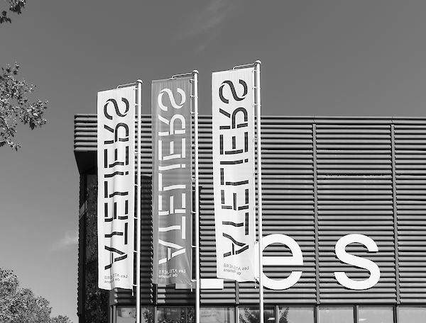
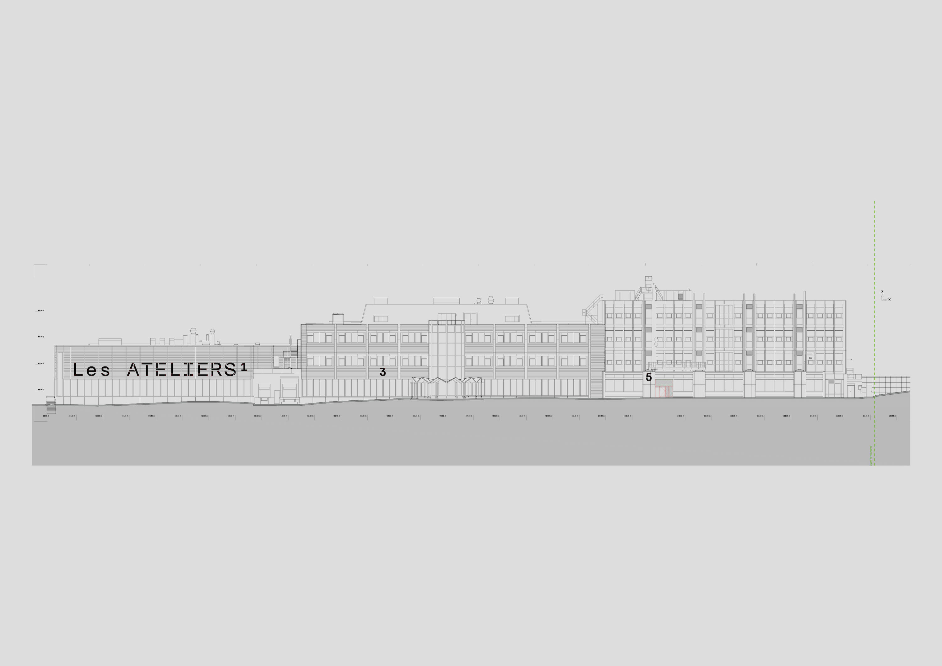
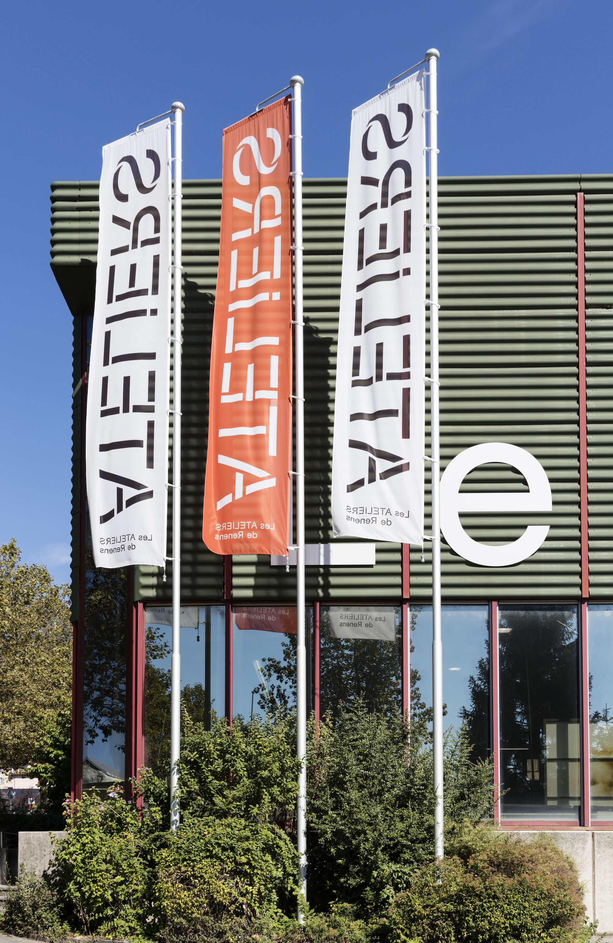
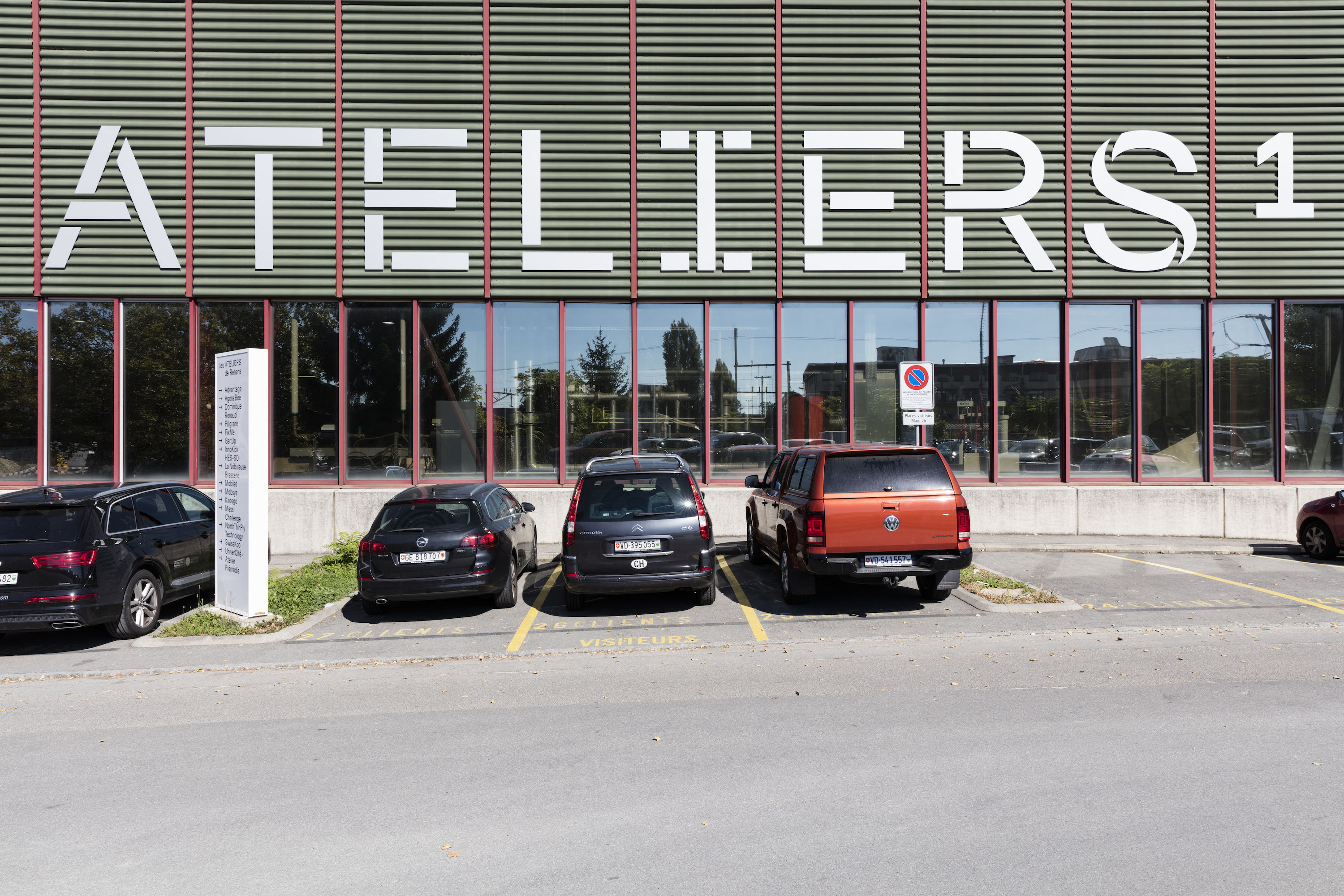
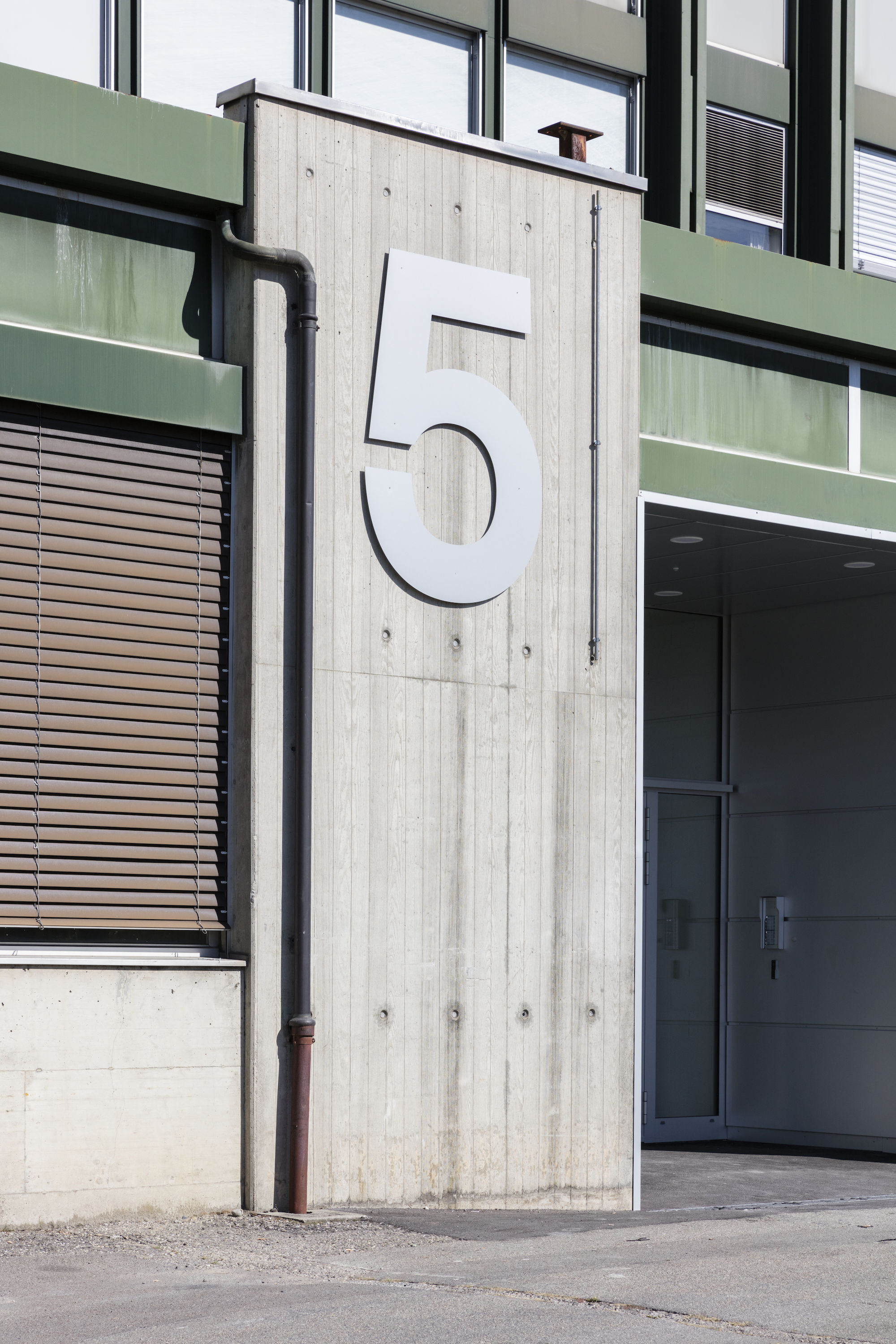
The Ateliers de Renens is a rental building of workspaces located near Lausanne. Dedicated to innovation, training and design, it offers 10’000m2 of industrial and administrative areas.
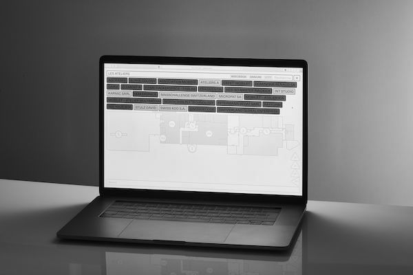
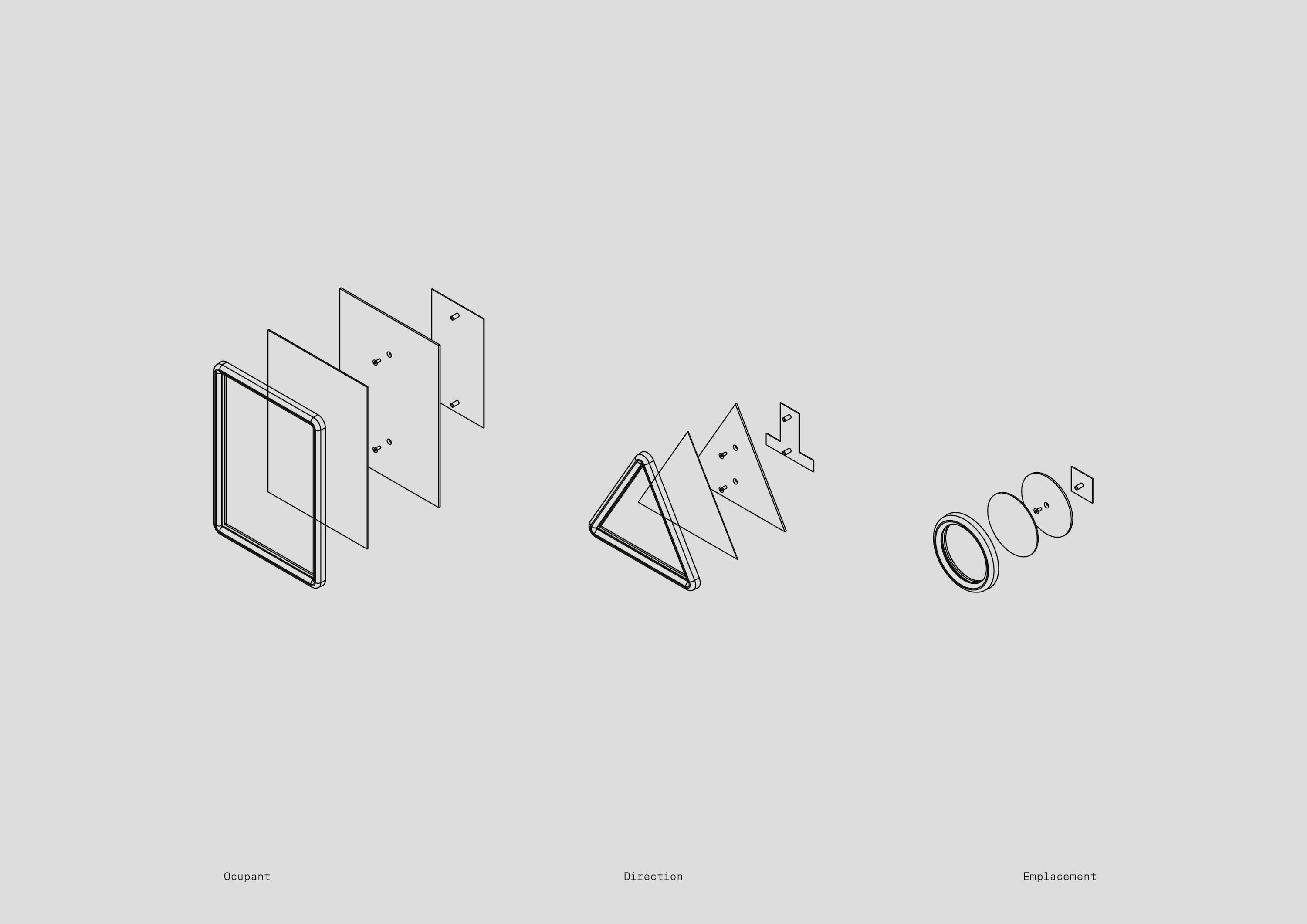
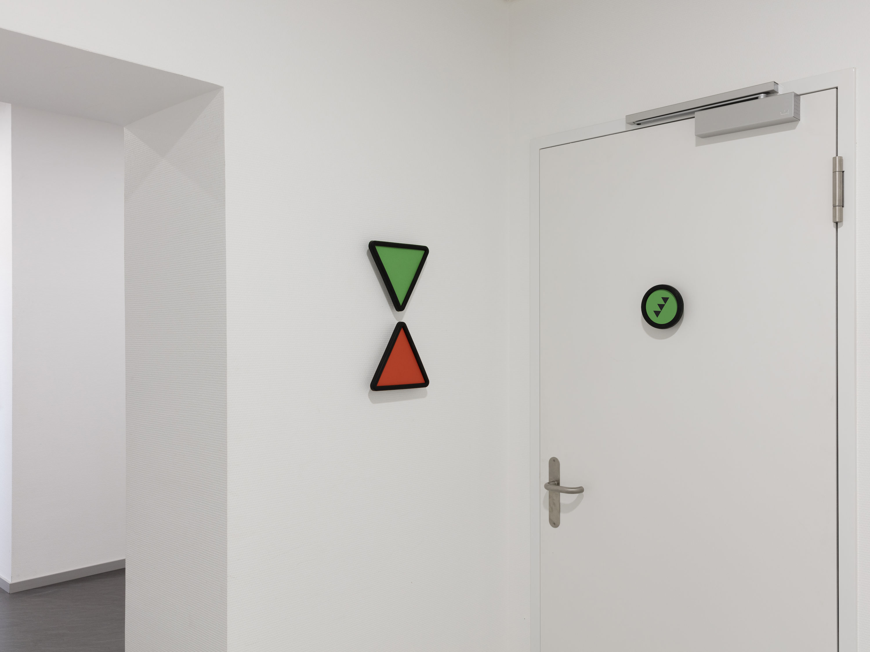
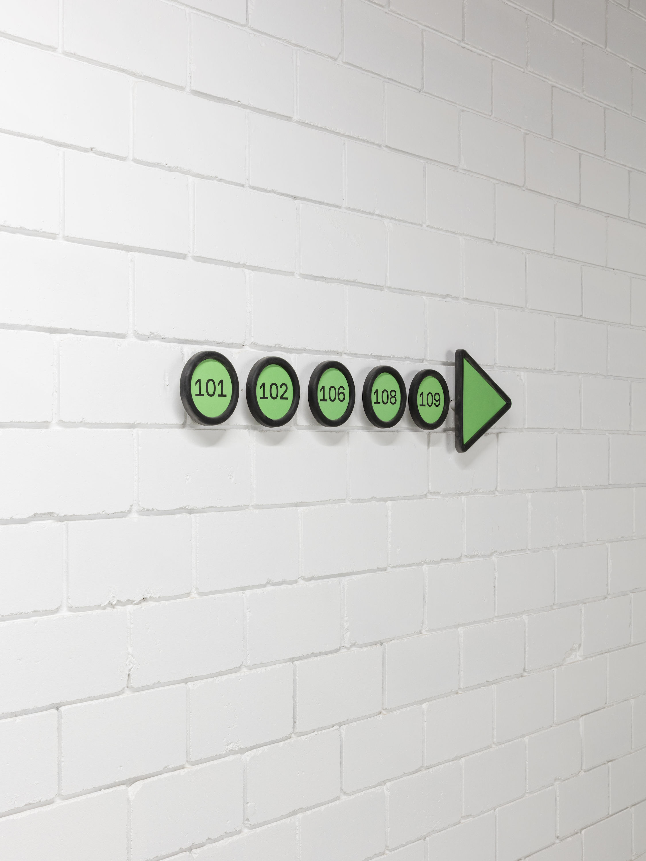
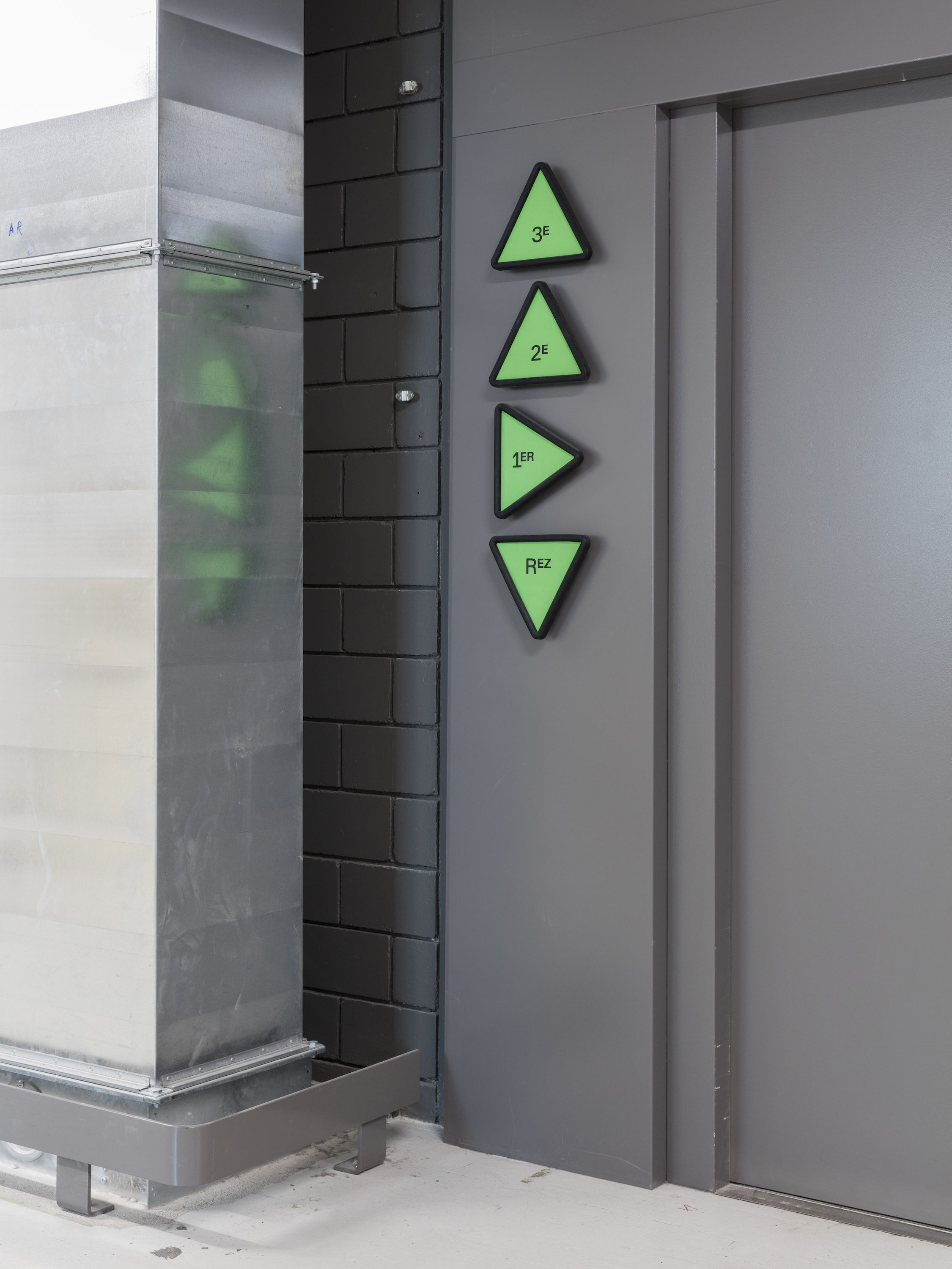
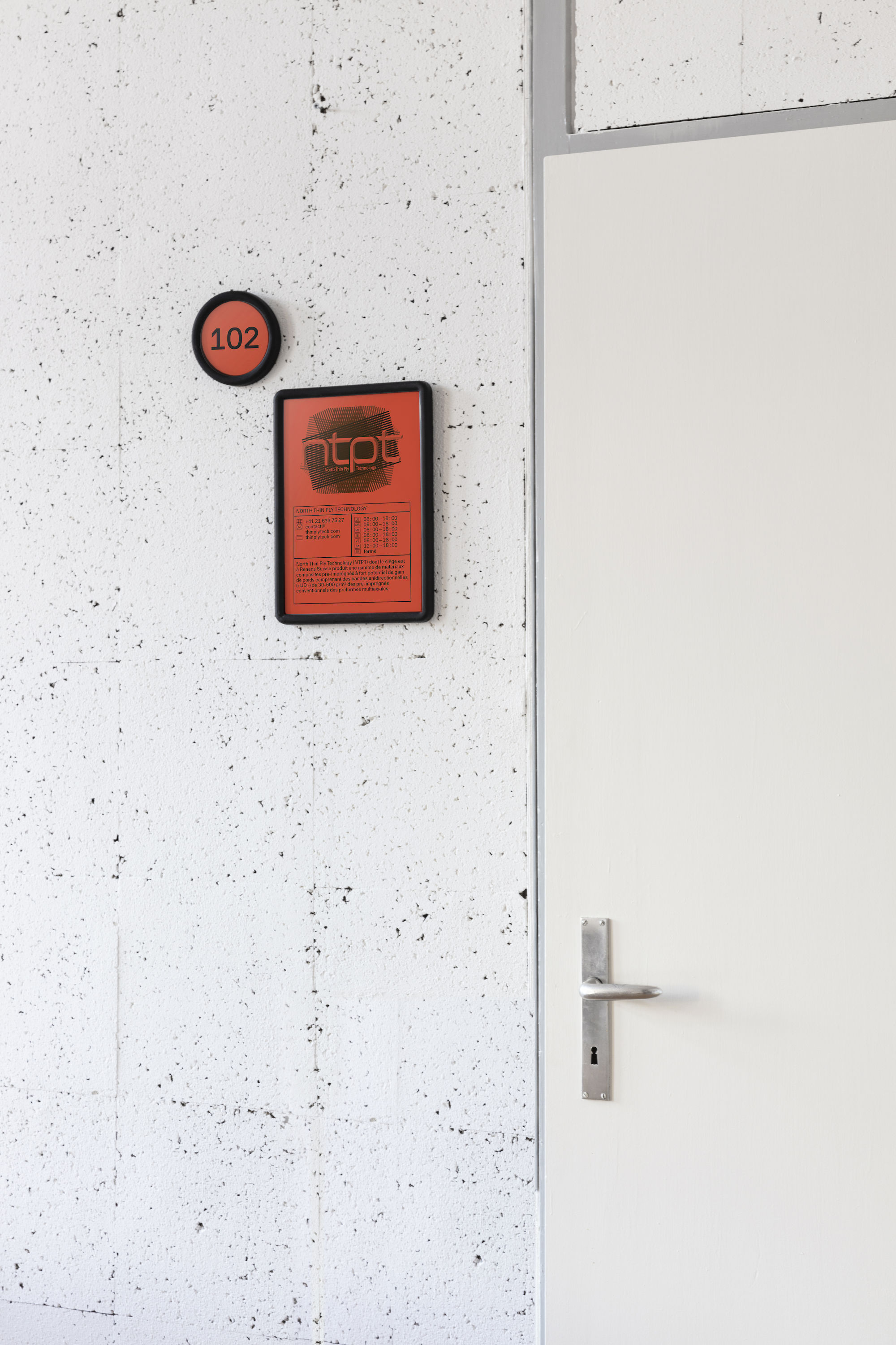
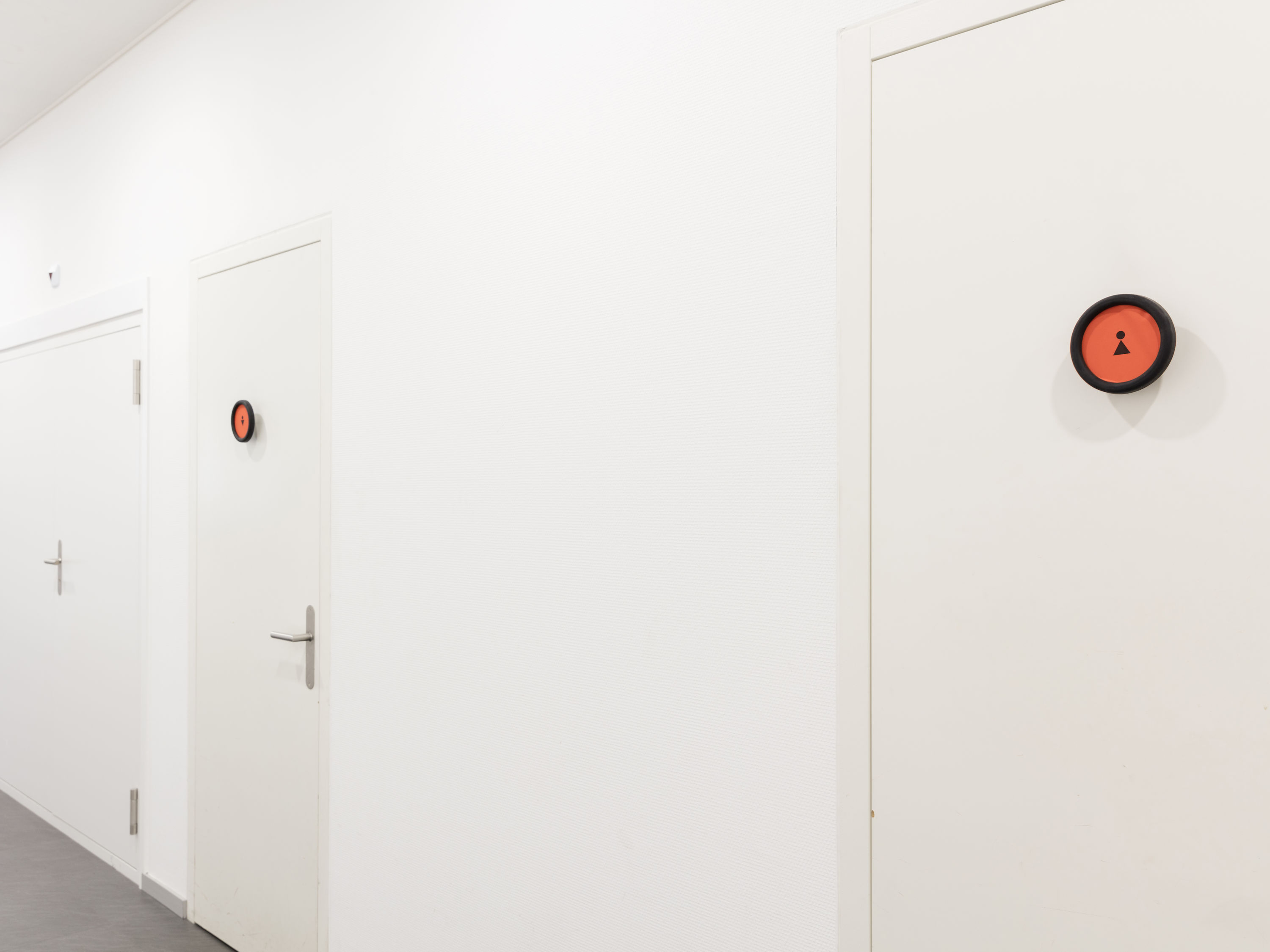
Due to the ever-changing variety of its occupants, I proposed to create a dual signage system, both digital and physical. The manager creates accounts for the tenants, each of them then inserts his/her information him/herself ( logo, contact, schedule ). While the signage frames ( designed in soft rubber by Adrien Rovero specially for the occasion ) are fixed to the walls, all of the information — space number, floor, directions — are generated by the site and printed on paper, making the signage update costless. The digital map is displayed on touchsreens at the entrances and on everybody’s smartphone.
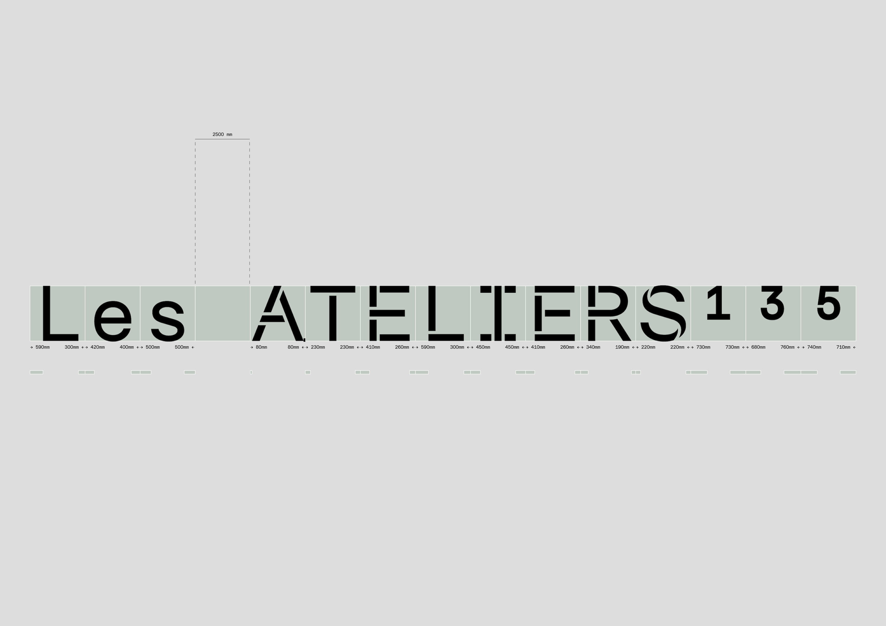
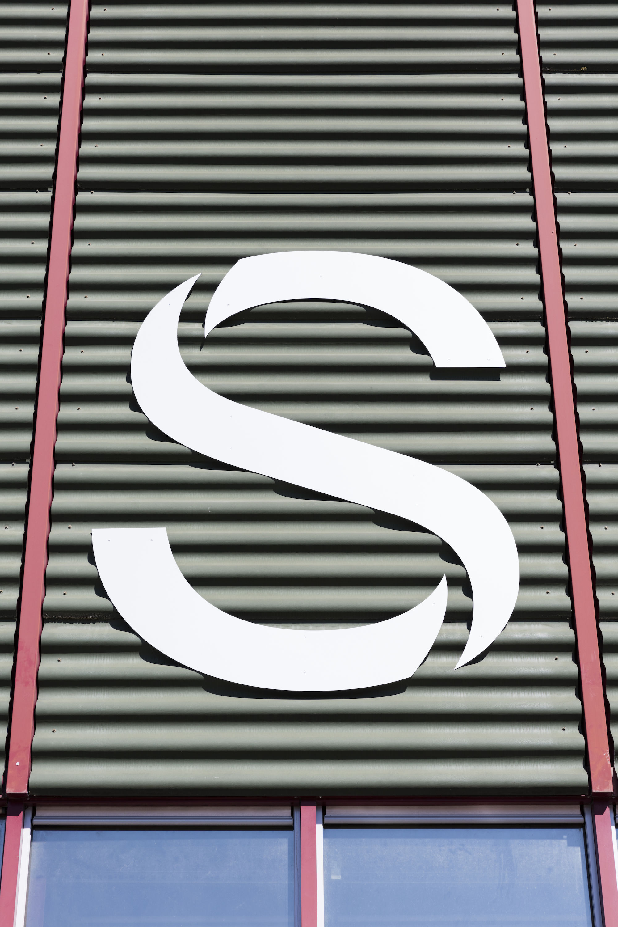
There are 3 buildings, containing more than 50 occupants and even 100 sometimes in the year. There are 3 colors, one for each building. There are 3 basic shapes ( used for the frames and on the website ): square for occupant, round for location and triangle for movement. The consistency of design is maintained across all media through the use of one font containing a wide range of specially drawn icons, reminding of the frames’ shape and outline.